The art of Mellon Collie and the Infinite Sadness
I was hoping to buy a thirtieth anniversary edition of the Smashing Pumpkins’ Siamese Dream album on vinyl but, for some reason, I’ve yet to find such a thing on sale. What did however appear in stock at my local online record store recently was, in some ways, even cooler.
I wouldn’t go as far as to say that Mellon Collie and the Infinite Sadness is the better of the two albums, even as a vinyl box set. SD sounds more musically consistent to me, although I’ve admired and owned both on CD for over twenty years now. Why, then, would I spend a not-insignificant amount of money on buying this particular album twice? The answer, as shallow as it might sound, is that even though SD is one of my top five favourite rock albums, MCIS has my all-time favourite album art.
There’s a weird synergy going on between the songs and the imagery of this record: in the same way that Peter Saville’s work goes hand-in-hand with the Factory Records label, or Hipgnosis and their collaborations with Pink Floyd, John Craig’s collages feel like part of the package in both a literal and a metaphorical sense.
Anyone familiar with alternative music of the 90s will probably know that MCIS was notorious for being ambitious, pretentious and bombastic, but at the same time it’s quite tongue-in-cheek: across its two sprawling hours it creates an experience that frequently veers into self-parody. There’s genuine romantic sentiment mixed into the acoustic folk, soaring ballads, experimental psychedelia and full-on heavy metal riffage, but there’s also quite a bit of ironic detachment and wry humour where the band seem to be poking fun at their own affectations and excesses. There’s that pun in the title for one thing.
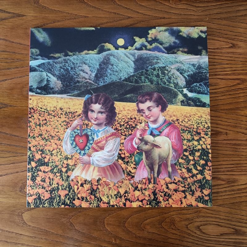
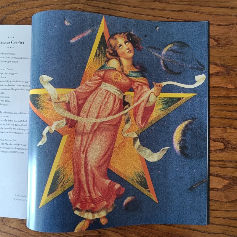
With rough sketches and vague prompts such as “cats getting married,” “children playing baseball” or “rats and squirrels in an opium den,” Craig was tasked with creating the visuals for the accompanying sleeve cover and inlay booklet. I doubt that he heard the songs before completing his work for the band, but the oddness and contrasts in mood between light and dark that permeate the songs are also reflected in his art: like the music within, it’s compelling and sometimes a little unsettling, but it’s also unpredictable and playful. In many cases, it shouldn’t work…but it somehow does. The childlike picture-book whimsy with its ominous undercurrents, reminiscent of John Tenniel’s collaborations with Lewis Carroll, matches unexpectedly well with the eclectic vibe of the songs. Its inherent absurdity and escapism endears it to me.
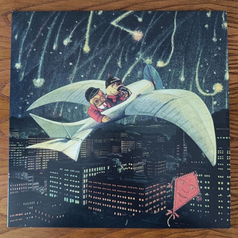
Aside from the iconic front cover which lives rent-free in my head (and which looks vaguely erotic to me, in a way that I can’t easily explain), my personal favourite piece was on the back cover to the CD case. Chicks Up depicts a couple of birds aboard an Edwardian-era propeller plane, soaring high above a nighttime city with a smiling kite drifting nearby. Is the surrounding sky filled with celebratory fireworks, or gunfire? What is a red kite doing there? Why are two birds, of all creatures, flying in a plane anyway? It’s incongruous, subtly very funny, and strangely beautiful.
From a technical standpoint, it may be easier – especially nowadays, with software like PhotoShop being much more accessible and ubiquitous – to recreate the same sort of thing digitally, without the time and effort of hunting down suitable components for the finished image. Similarly: it’s now relatively straightforward to arrange an eight-minute rock epic with multiple instrumental overdubs, compared to the mid-90s when Pro Tools was a recent innovation. But then, both the Smashing Pumpkins and the artist they commissioned for their now-famous double album found a real sense of accomplishment and meaning in doing things the old, labour-intensive way. Without going on a tangent about AI and how advanced tech is just another set of tools: I really appreciate the end results of the old labour-intensive way, even if it took more time and tested bandmate friendships to destruction.
And now, after parting with a fat wad of cash to buy a vinyl box set, I’m trying to talk myself out of spending even more on an art print of two birds in a steampunk aeroplane.